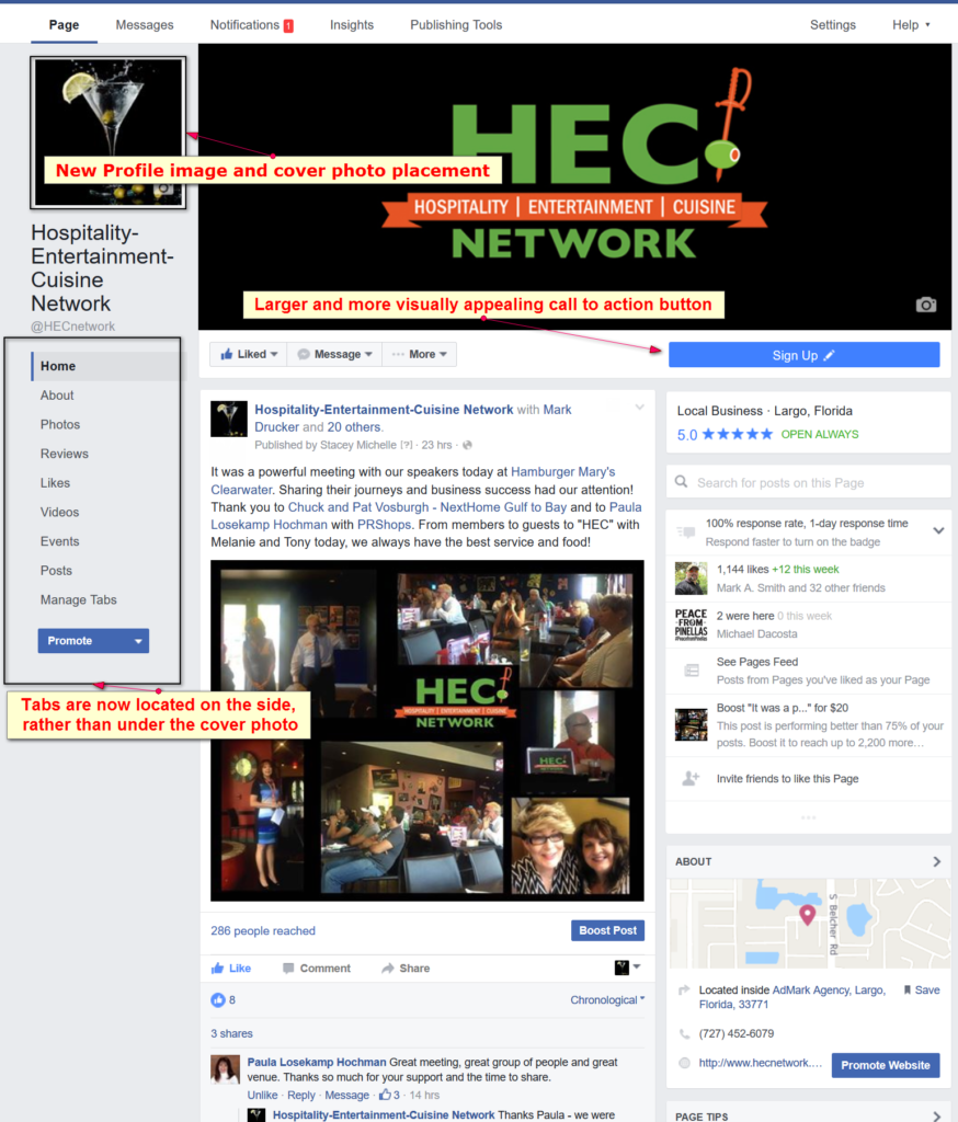
We were so happy to see the new layout today when we popped on to manage our clients’ Facebook business pages. It is super clean and we think it’s going to provide a more functional layout for marketing your business. Don’t worry if you don’t see the new layout yet, from what others are saying, your view will change very soon. Here is a sneak peek in case you are still waiting for it to roll out:
 The biggest change you will see first is the separation of the profile photo from the cover photo. Even though we are excited about this, there is one thing that stood out to us about the new layout. We sometimes use the profile photo as a way to make the page more visually appealing by adding elements that flow between the two, but this option has gone bye-bye… and it’s sad! On a lighter note, having more space in the design of your cover photo is a comparable replacement. We won’t be sad for long!
You will also quickly notice that the Call to Action button is much larger, making it easier to see. In the marketing world we always make our CTA’s big; they have to stand out! With this new change, Facebook made a great move so make sure you are using your CTA button!
Our guru checked to see if the guidelines changed for cover photo design, and we found nothing new. The guidelines are still pretty simple: Don’t be a meanie head and steal someones brand/logo or anything else, don’t be misleading etc… You know, things they really shouldn’t have to tell you!
In their, more professional, words – Facebook Page Terms, regarding your cover photo reads:
B. Cover
All covers are public. This means that anyone who visits your Page will be able to see your cover. Covers can’t be deceptive, misleading, or infringe on anyone else’s copyright. You may not encourage people to upload your cover to their personal timelines.
As our team learns more about the new layout and upcoming changes we will be sure to share them with you. We welcome dialogue so please comment and ask questions, but for now we have to go – there is so much more to see!
UPDATE – AUG 2016
Looks like they got rid of the 20% text rule on ads. Prior to this change, it was a thought filled task to ensure you chose just the right image – you know, the one that says it, without having to say it? Oh and making sure the words you chose were perfect as a call-to-action to enhance your ad. It isn’t as easy as it looks. With this new change, Facebook puts no limit on the amount of text you can have in your image. This doesn’t necessarily make the job easier, or mean you should have an image full of words, however it does give you a bit more flexibility. Be careful not to over stuff your image with words as it could still effect the overall success of your ad.
Another, less attractive, change is regarding visibility. it’s always been a bit of a challenge for businesses to get in front of their customers on Facebook – you need to know the algorithm, what your customers want to see, and how to instruct and educate your customer to take certain actions to be sure they see your posts.
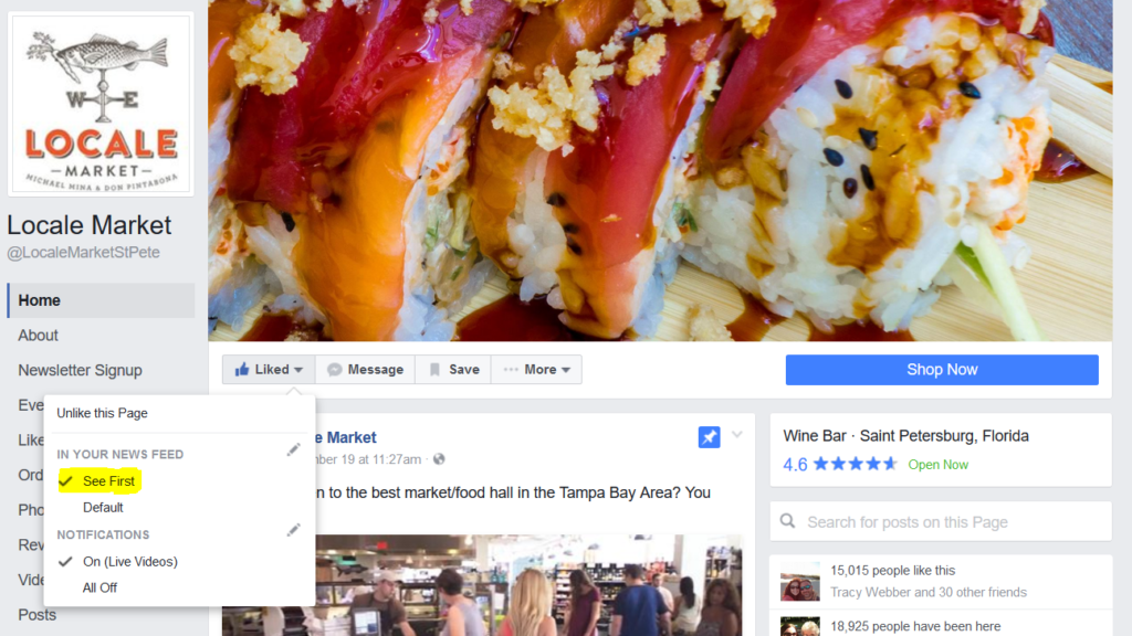
As a business owner it would be a good move to send out an email blast letting your customers know that you share valuable and relevant information on Facebook and they should make sure to click “see first” on your page if they want to be sure to keep in touch.
So what does that even mean? Check out the Locale Market Facebook page – I love this place and since I don’t want to miss the latest, I checked the “see first” setting. Now they, among some of my other favorites, will show up in my newsfeed.
HELPFUL FACEBOOK LINKS:
